New face, same Griffioen
21st July 2021
Griffioen is going to move and with a new start comes a fresh look! In the past few months we have worked closely together with Verve Design Agency to create a new corporate identity that perfectly fits with who we are and who we want to be in the future. After all, a corporate identity is about much more than colours and shapes. A good corporate identity shows at a glance what your organisation stands for. Implicitly. And that is quite a task.
High time
Anyone who took a look at Griffioen quickly saw that there was little visual consistency in our (communication) tools. They were independent, but not part of the story of Griffioen as a whole. Bar and desk staff at Uilenstede were still wearing black shirts with colourful lettering in 2020, typical of the house style of ten years ago. The 2016 website was designed based on style elements of the VU. And printed products were created according to the taste of the individual designer. Last year, a renewed attempt was made to bring some consistency to the Griffioen look and feel, but this did not quite cover it either. It was time to call in help.
With Verve
In the autumn of 2020, we contacted Verve Design Agency. A design agency with expertise in the cultural field. They not only developed the corporate identity of film theatre Rialto, our cultural partner, but also of Theater Rotterdam, Theater de Veste, Ancienne Belgique and many other cultural institutions. With a team of enthusiastic professionals, we took a close look at the Griffioen brand to offer the designers of Verve a starting point. We looked at our mission, vision, target groups and our position in relation to the Vrije Universiteit. The brand feeling soon became clear. At Griffioen you unwind. Free from 9 to 5, free from your studies, free from your work. With cabaret, music, dance, theatre and countless creative courses.
The promise of the evening
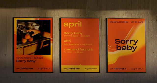
At the end of the working day, when the evening falls and you can finally close your laptop, this is the place where it happens. At Griffioen, you get away from all your obligations, relax, discover and come together. This freedom is reflected in the visual element of the swarm, which can take on any form. Free, loose, but with a coarse grain that rubs a bit. Because there is always an element of tension in a fun night out. What will the evening bring? What are you going to learn? What are you going to discover?
The promise of the evening is also reflected in our use of colour. The warm colours of the sun that slowly fade into dusk, evening and night at the end of the afternoon. But with playful accent colours.
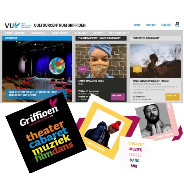
The typography is characterised by broad, round shapes and fits in well with the typography of the Vrije Universiteit. The playful triangle that is used in some expressions is also a nod to a VU style element. Now that we are moving to the VU campus at De Boelelaan 1111, we will continue as VU | Griffioen. The two playful FFs in the word mark represent the wings of the familiar Griffioen logo.
Full of pride
After months of brainstorming, consultation, adjustments and checks, we now have a new styleguide that will help us in the coming years to strengthen the connection between our beautiful range of services and you, our loyal guests. We are very proud of the result and it is great that we can finally share this with you. Verve has done a fantastic job and X-Com has translated this into an amazing website. We hope that you like it as much as we do. There are a lot of nice things waiting in the near future. We would like to invite you to discover this with us. See you soon in Griffioen!